Background
Authors and publishers use BookBub's Partner Dashboard to create and manage marketing initiatives for their books. A core part of this experience is monitoring the status of various promotions, including display ads and newsletter features. Power users, like larger publishers and marketing-savvy independent authors, can often have hundreds of promotions of any given type, which makes filtering and sorting those promotions an essential part of the user experience.
As a part of the larger filtering and sorting revamp, I was tasked with designing a universal date picker that could be used across the partner dashboard, for filtering every promotion type and for use on forms. The finished component needed to be flexible enough to accommodate this different use cases, while also maintaining enough consistency to feel familiar and intuitive across the dashboard.
Existing Calendar Components
As BookBub's product offering grew, so did the Partner Dashboard. As different engineering teams added new promotion management pages, they would use the date picker du jour, leaving many different interface approaches to the same problem.
To begin the process of unifying the UX of date selection, I took inventory of existing date selection components across the dashboard:
Display Ad Campaign Filtering
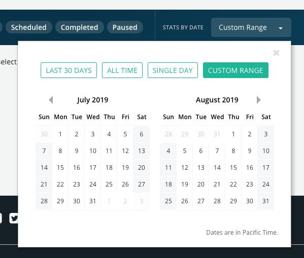
| Strengths | Weaknesses |
|---|---|
| • Consistent visual style • One click selection of common date ranges |
• Dates inputs not editable by keyboard • Switching between single date and date range is awkward • No indication of current date |
Featured Deals & New Releases Filtering
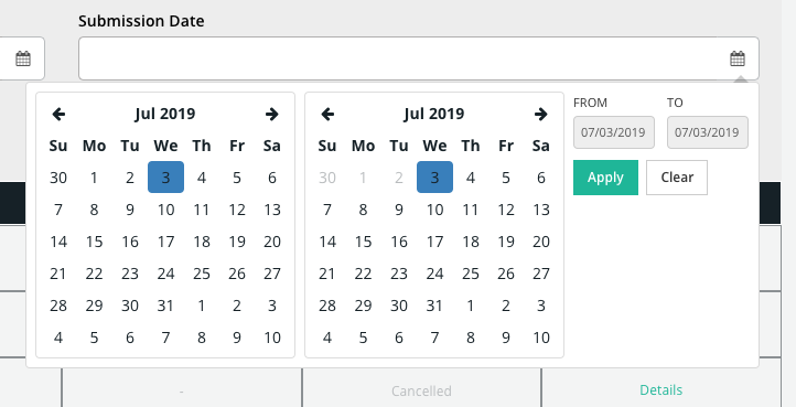
| Strengths | Weaknesses |
|---|---|
| • Dates visible when picker is closed |
• Dates inputs not editable by keyboard • Calendars navigate independently • Visual styling is inconsistent |
Display Ad Creation Form
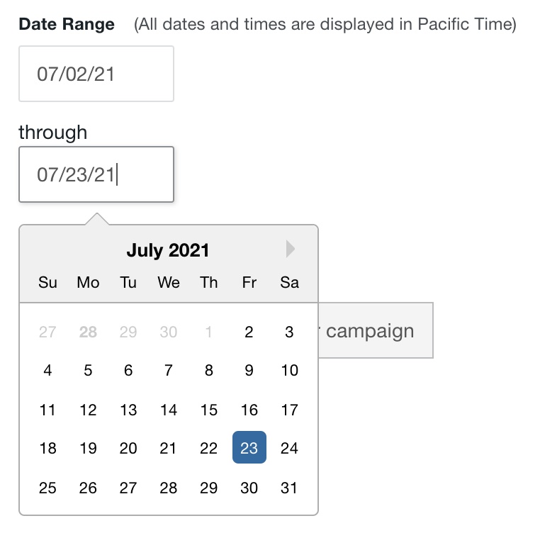
| Strengths | Weaknesses |
|---|---|
| • Date inputs editable by keyboard • Indication of current date |
• Separate input components for start and end dates • Inconsistent visual styling |
Project Requirements
• Accommodate single date and date range selection
• Allow for keyboard only selection of dates, for accessibility and power users
• Match visual style of existing UI form elements
Design Cycles
First Iteration: Visual Alignment
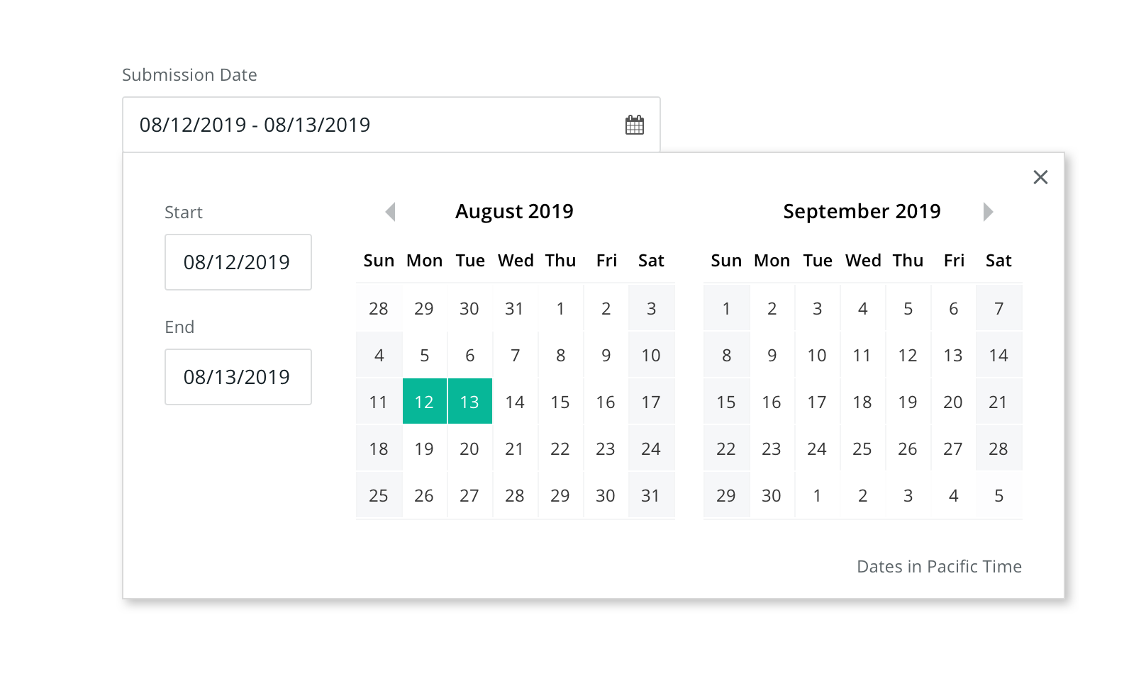
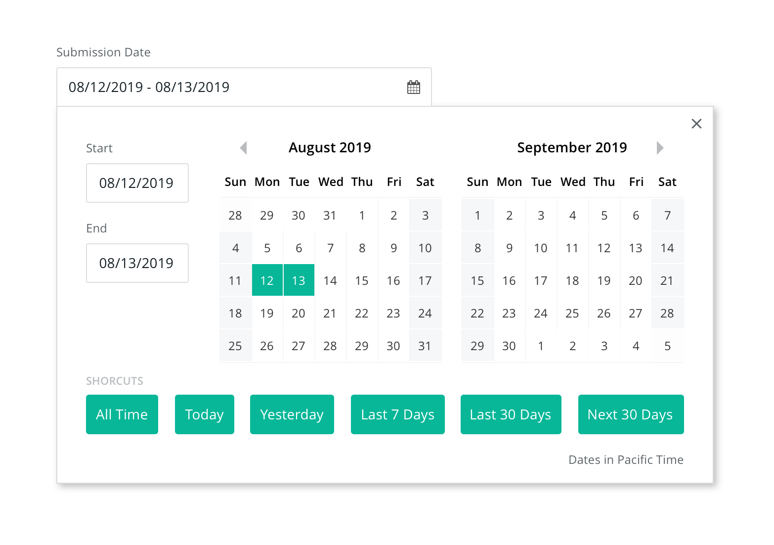
The first design pass focused on visual alignment. Using the date range calendar input component from the Display Ads Filtering section of the site, I added start and end date inputs and roughly followed the original layout of the Featured Deals Filtering component.
Second Iteration: Add Shortcuts
Next, I considered how to incorporate the one click selection of common date ranges from the Display Ads Filtering component. That component presented different date pickers based on type of date being selected (range vs single), or no date picker at all if the range was not customizable (last 30 days, all time, etc). My goal was to maintain a single, unified date selection interface, so instead I created a "Shortcuts" button group. Selecting a shortcut selects the date range corresponding to that shortcut. For example, selecting last 7 days on January 8th, 2021 would select a range of 1/1/21 - 1/7/21 on the calendar and start and end date inputs.
Third Iteration: Consolidate Input Fields
At this stage, we had a functional, full featured date picker component that visually aligned with its parent UI. But there still remained some issues that hampered usability and accessibility, most notably with the input fields. The previous iteration used two sets of input fields that mirror each other: the start-end date range that displays the dates when the picker is closed and the individual start/end date inputs in the picker itself. These would be cumbersome to keep in sync and present multiple places for a user to edit the same value in the same way.
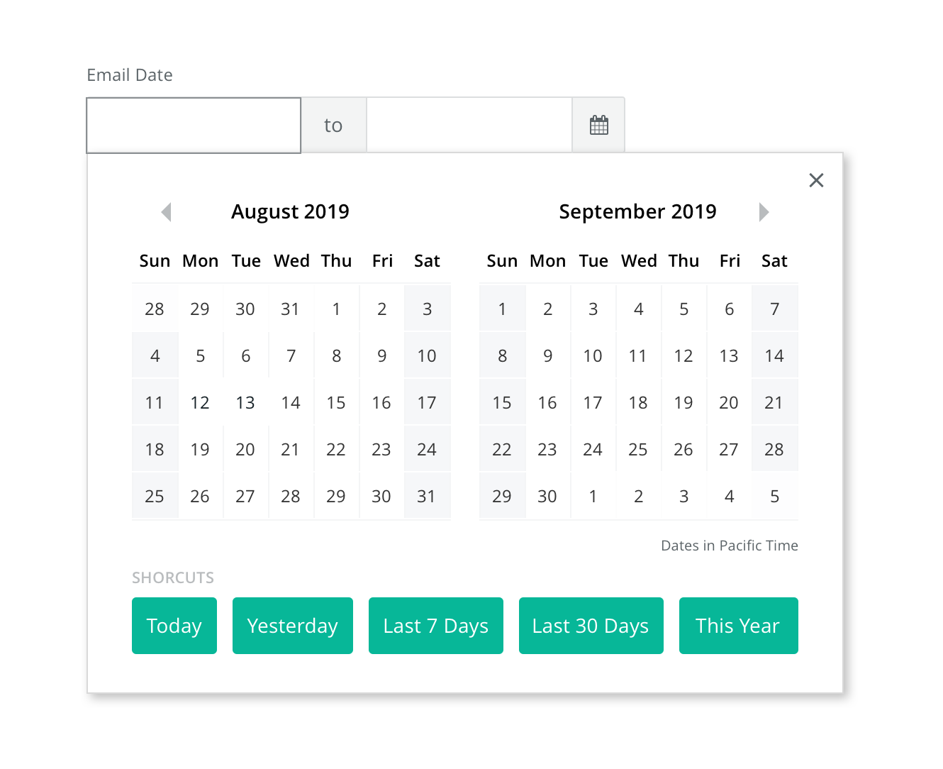
To alleviate this issue, I first removed the independent start/end date inputs, leaving only the top level date range input. This was an improvement, but this single text field was less intuitive for entering dates with a keyboard. This could be partially helped by a visible input mask, but that approach still felt visually clunky, and it would be difficult to communicate that mask to screen readers. Instead, I replaced the single date range input with a segmented input that contained separate start and end date inputs, linked by a static "to" connector. This interface provides easier keyboard input, easier accessibility labels ("Start Date" and "End Date"), and provides a stronger UI sentence for the user to complete ("I want promotions from ____ to ____").
Final Iteration: Date Selection Affordances
With the overall structure of the picker finalized, my final area of focus was on the UI affordances for selecting date ranges. Selecting multiple dates on a calendar is a surprisingly complex task, because it can be difficult to disambiguate user intent, especially in edge cases. The initial range selection is easy to follow: the first click represents the start date, the second (on a later date) represents the end. But what if the user's second click is on a date before the start date? Does the user intend the start date to become the end date? Or do they intend to clear the date selection all together? Furthermore, after a valid date selection, what does an additional click mean? In the case of a click before the start date or after the end date, it might be reasonable to suspect the user intended to extend the date range, but what about in the middle of the existing range?
Rather than make opaque attempts to disambiguate user intent, we settled on a simple cycle of date selections: the first click always selects the start date, the ends click selects the end date. Additional clicks start the cycle again, clearing the date range and selecting the start date. To help users understand what effect their click will have, we added two affordances. The first is introducing a highlight state that identifies dates that are a part of the current range. This state activates after a start date selection and is active on hover, until being locked in when the user selects an end date. Second, I leveraged the focus state of the segmented input introduced in the previous iteration to indicate which date will be selected by the next click. Upon opening the date picker, the focus state of the start date input is activated (visually strengthening the border). After a start date is selected, the focus state shifts to the end date selection. After an end date is selected, the focus shifts back to the start date, in case the user wants to re-input their date.